Wedding Planner
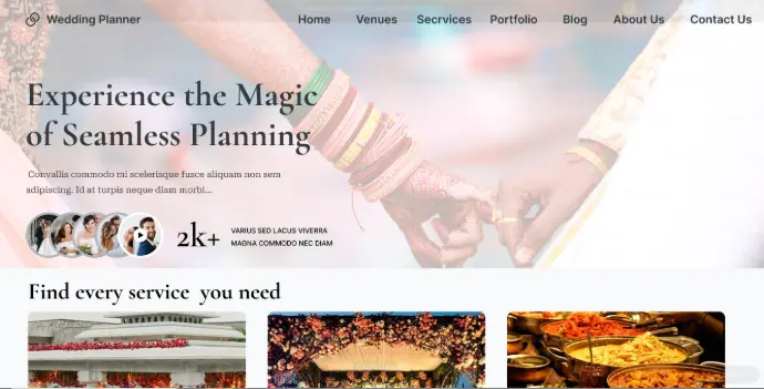
The Wedding Planner website is a user-friendly digital platform designed in the Figma.The design focuses on simplicity, elegance and intuitive navigation, ensuring couples can plan their special day with ease and excitement.

Overview
Planning a wedding is often overwhelming, involving multiple vendors, budgets, and countless tasks. Many couples struggle to manage everything in one place, leading to stress and missed details. The Wedding Planner App aims to simplify this process by offering a single digital hub where couples can organize, choose between multiple vendors and collaborate on every aspect of their wedding.
Role - UI/UX Designer
Tools - Figma
Pain Points
- Users prefer visual-first layouts-🗣️ “I want to see photos, not read long descriptions.”
Cluttered Dashboards- 🗣️ Existing wedding apps overload users with too much information on the home screen.
Poor Navigation- 🗣️Multiple menus and sub-menus confuse users.
Inconsistent Visual Language-
- Some apps mix formal (corporate) and casual (fun) tones.
- Fonts, colors, and buttons don’t feel cohesive or wedding-themed. 🗣️ “The app doesn’t feel elegant enough for a wedding—it feels generic.”
User Persona

(Priya, 28)
The Bride-to-be
- Tech-savvy, loves Pinterest for ideas.
- Wants to stay organized and stress-free.
- Easily compare vendors with transparent pricing and reviews.

(Rahul, 35)
The Planner
- Manages multiple weddings at once.
- Use a clean interface that doesn’t feel overwhelming.
- Prioritizes communication with vendors and deadlines.
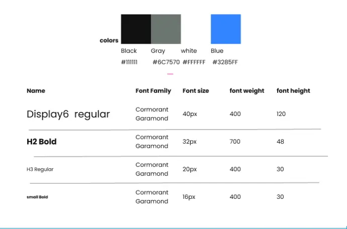
Style Guide

Redesign Goals
Make it simple, but significant.
Improve Vendor Discovery & Transparency
Enhance vendor browsing with clearer pricing, detailed profiles, reviews, and comparison tools so users can make informed decisions faster.
Improve Visual Clarity & Reduce Clutter
Introduce a balanced layout with proper spacing, visual hierarchy, and consistent design elements to reduce cognitive load and create an elegant experience aligned with wedding themes.Ensure proper contrast, readable typography, scalable UI sizes and compatibility.
Simplify the User Experience
Make the app easier to navigate by reducing complexity, reorganizing menus, and creating a clean, intuitive information structure so users can quickly find what they need.
Challenges and learnings
- It was interesting to understand the business needs and targets after connecting with the stakeholder.
- Wedding apps need to look elegant and romantic, but too many decorative elements can reduce readability and accessibility.
- Couples come from different cultures, budget ranges, and traditions. Designing a flexible, personalized experience without complicating the UI was challenging.